 11-10-2005, 09:15 AM
|
#1 (permalink) |
|
narcissist
Location: looking in a mirror
|
New Promotional Package
I haven't posted any new work in a while, so I wanted to take a chance to let everyone see what I've been doing lately.
These are both for a project in my Graphic Design class. We're creating a package including a brochure, poster, and two postcards for a local conservatory and its nature trails. The conservatory is part of the local art museum. As part of the assignment, we are allowed to "make up" an event to promote. I chose to focus on a fictional cocktail party to be held in the conservatory to promote the Conservatory's collection of orchids and koi as well as the Museum's fictional collection of recently aquired Asian artwork. The first piece is the logo for all of the pieces, and the second is a version of the poster I'm making. My professor said it was a bit too editorial, so future versions will address that. *I just noticed that when I was converting the .AI file to post here, I didn't crop the left side to the right proportion. There are crop marks on the final version, so that shouldn't be a problem when printing. Sorry for the inconvenience! Lemme know what you think! 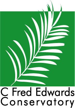  And on a totally separate note, here are two sketches (one pencil, one Illustrator) that I'm planning on turning into a painting eventually: 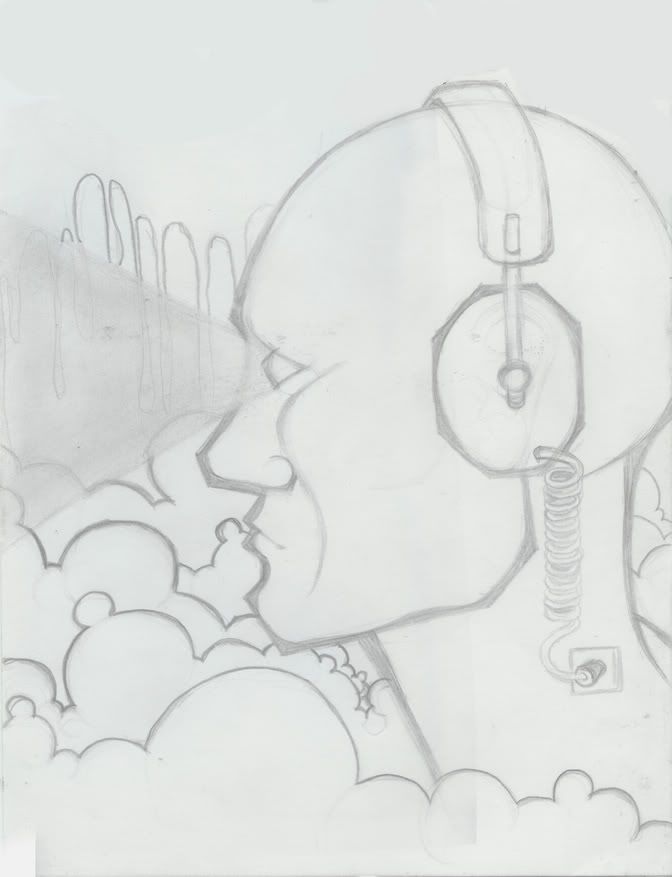 
__________________
it's all about self-indulgence |

|
|
11-10-2005, 09:33 AM
|
#2 (permalink) |
|
Tilted
Location: Maine
|
The logo is great. I love the simplicity. I also really love the clouds in the colored version of your sketch. I do, however, like the softness of the sketch compared to the defined black lines of the colored one. But that's just a small thing, as they're both amazing. You're very talented!
|
|
|
|
11-10-2005, 02:27 PM
|
#3 (permalink) |
|
lascivious
|
I like the poster allot. Great colors and layout. The logo is nice but it could use more work. The leaf looks cool but you need better text and the green/white line isn't really effective enough, perhaps you should bring it down a bit or something. Just my opinion...I am far from an expert on these things.
The picture is sweet, can't wait to see the painting! |
|
|
|
11-10-2005, 05:43 PM
|
#4 (permalink) |
|
narcissist
Location: looking in a mirror
|
Thanks for the comments!
pandafaye: I agree with the linework being much better on the sketch. The colored version has a much harder/thicker line than I'd prefer...I mostly just did it to pick out some initial colors to work from. Mantus: Thanks for the comments. When you say that i need to bring down the greenline, what do you mean? (my professor said something similar, and I'm wondering if you meant the same that she did)
__________________
it's all about self-indulgence |
|
|
|
11-10-2005, 06:26 PM
|
#5 (permalink) |
|
lascivious
|
The color flip line of green/white to white/green on the leaf gives a very nice effect. It works especially well because the object has allot of detail. But this effect is way at the top so it really doesnt have much impact.
To have more effect I think the color flip line would have to come down a bit, but then you'll have all that white space at the top...heck I duno. How about this. Keep the leaf in the same possition. Instead of having the green space go margin to margin make it a green rectangle on a white background. That way you have white space all around with bits of green leafs sticking out on some or all sides...just a though. [edit]Hmm i think that would look like a hary rectangle then...oh hell ignore me  Last edited by Mantus; 11-10-2005 at 06:28 PM.. |
|
|
|
11-10-2005, 09:23 PM
|
#6 (permalink) |
|
narcissist
Location: looking in a mirror
|
You said the exact same thing as my professor! She thinks that bringing down the top line of the square a little bit would make it more impressive.
The white area around the logo isn't actually there in practice, since it's on a transparent background (just fyi). I think your idea about making the green square smaller on all sides is actually the best idea I've gotten so far! It would allow me to keep it square but still let the leaf extend farther out of the box. Thanks for the thoughts.
__________________
it's all about self-indulgence |
|
|
| Tags |
| package, promotional |
|
|


