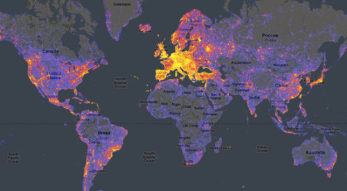
although the above visualization may be difficult to see (though you can always click it to 'embiggen')
I think the point gets across quickly, when realizing the title of it.
It shows a trending and geographical survey of the world's most popular tourist attractions,
with that of the 'hot spots' being denoted by the rising and warmer colors.
also, the official word...
author's comments:
Great places-to-avoid heatmap, using distribution of photos on Panoramio. Nice idea! By BlueMoon.ee
--
courtesy of Information is Beautiful