(click the image to download the full-size portrayal, only if you want to see it bigger)

by
Jonathan Gosier
all information provided and detailed by the graphic are taken from sources within the last six months.
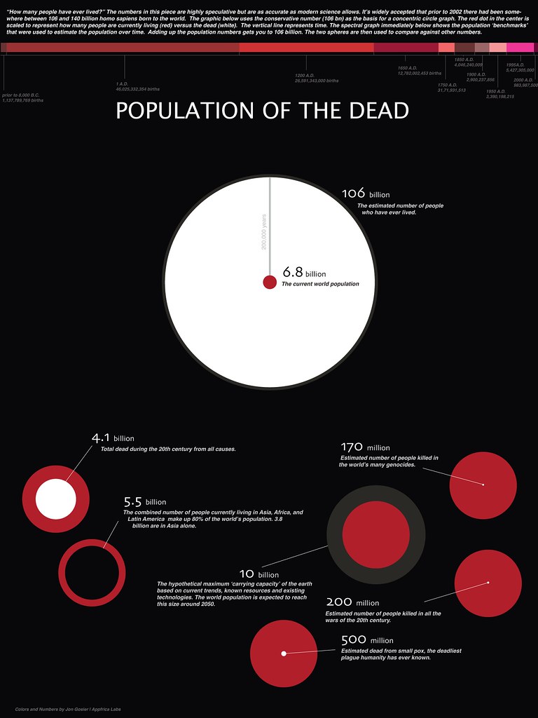
header (synopsis) from the image:
The numbers are highly speculative but are as accurate as modern science allows. Its widely accepted that prior to 2002 there had been somewhere between 106 and 140 billion homo sapiens born to the world. The graphic below uses the conservative number (106 bn) as the basis for a concentric circle graph. The red dot in the center is scaled to represent how many people are currently living (red) versus the dead (white). The vertical line represents time. The spectral graph shows the population benchmarks that were used to estimate the population over time. Adding up the population numbers gets you to 106 billion. The two spheres are then used to compare against other numbers.
read more about the speculation, debate and 'carrying capacity' of our world's resources from the source of visualization
here.